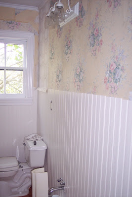
the non-ugly bathroom!
First, you must go here to look at the before pictures. The Ugly Bathroom was the first one I discussed. I mean, what the heck...that bathroom was ugly. After that post, The Brother fixed the door so that I could close that room off while all the other rooms got pretty. I'll be honest. I ignored it for quite some time. I also waffled quite a bit on a lot of different aspects of it. Finally, over the last 3 weekends it became this.
The Brother came over and added beadboard:

I guess the not-pictured first step (oops!) was me putting down a new floor. Um, and then painting the ceiling, trim, door, and cabinets. With the addition of the beadboard, the bathroom was less than half as ugly as it was before. At this point, I left the door open. It made me excitedly motivated. Next up? Paintable wallpaper. I picked a kind that looked reminiscent of old tin ceilings.

And so it was not The Ugly Bathroom. It was the totally white bathroom. Like I could have a white room in my house... While I was picking up the paint on Friday, I realized that this solidifies it. I am not afraid of color.

Yep, the Black and White Bathroom. We still need to do a little caulking, put up the trim, and finish the floors but woohoo! I'm very excited. And The Fiance didn't hate it. (He was quite skeptical of black but I told him it would be great and that I'd repaint it if he absolutely hated it. Granted, the bathroom would lose square footage due to the numerous coats it would have taken to paint over black...) Here's the nearly finished product and a few details.


Comments
It looks great, good job! Love the bead-board, too.
I can't wait for us to start brainstorming on the baby's room! :-o
Custom / Exterior remodelings,
reasonable prices,license,
references,photos,free estimates,
also obtain houses to renew:
http://www.renewhouse4u.com.
Mobile:410-978-7981.
Thanks.